
If you've ever sat down to colour and spent longer choosing your markers than actually colouring, you're definitely not alone.
With so many beautiful Decotime alcohol marker colours to choose from, it can be surprisingly difficult to decide which ones work well together. Before you know it, you've got dozens of markers scattered across your desk, you've changed your mind three times, and you still haven't coloured a single section.
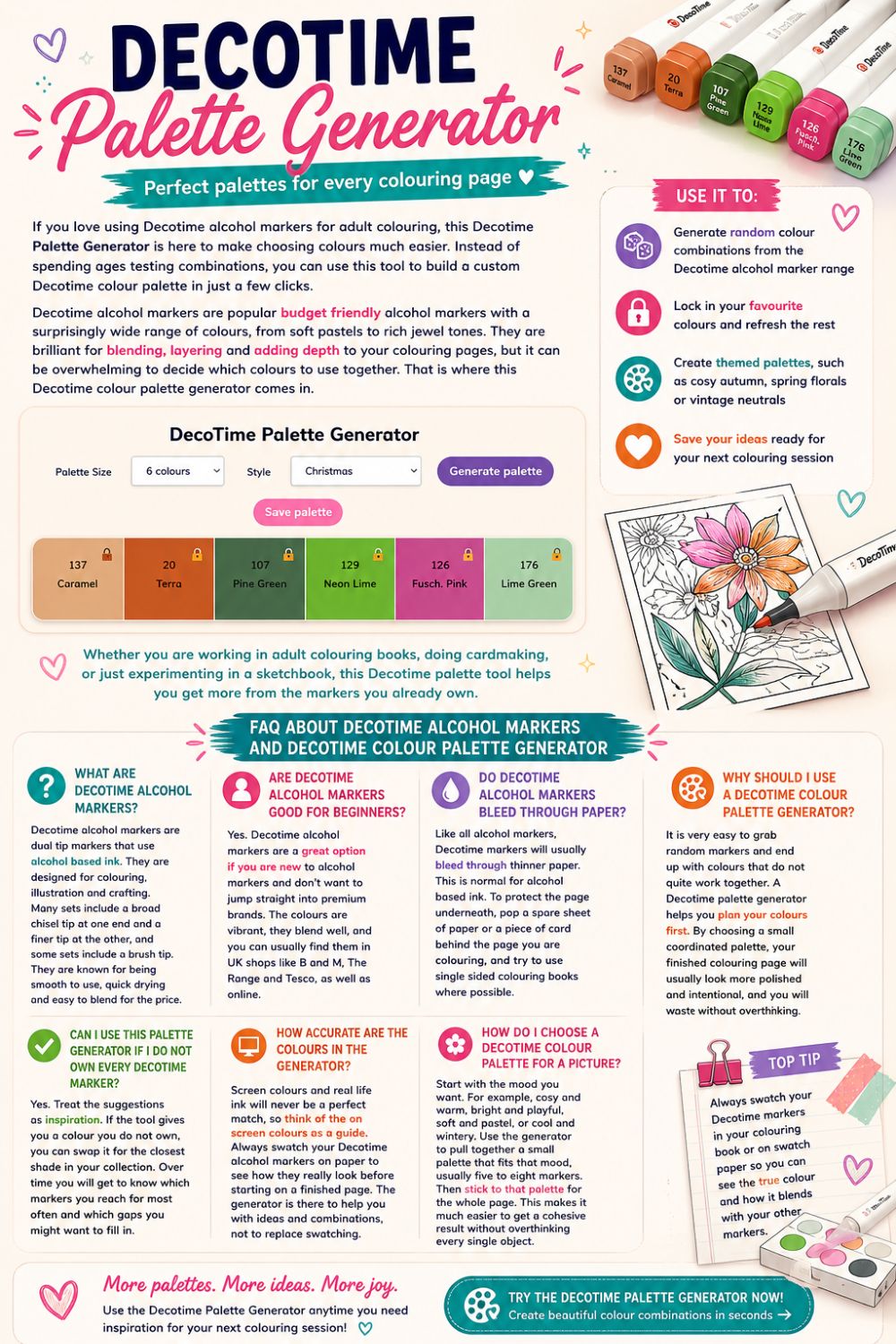
That's exactly why I created this free Decotime Palette Generator.
Rather than spending ages trying to build the perfect colour combination yourself, this tool instantly creates coordinated palettes using Decotime alcohol markers. Whether you're looking for soft pastels, cosy autumn shades, bright summer colours or festive Christmas combinations, it gives you inspiration in just a few clicks.
You can even lock your favourite colours, regenerate the rest of the palette and save combinations for future colouring sessions.
Whether you're colouring in Disney books, Coco Wyo books, Bold & Easy colouring books, sketching, journalling or creating handmade cards, this generator helps remove the guesswork and lets you spend more time enjoying your hobby.
Why I Created This Decotime Palette Generator
I've always loved colouring, but one thing I've never loved is deciding which colours to use.
I'd open one of my favourite colouring books, get my Decotime markers out and then spend the next ten minutes swapping colours around before I'd even coloured the first section.
Should the flowers be pink or purple?
Would a warm brown work better than a cool brown?
Should I use six greens or just two?
Eventually I realised I was suffering from something called decision fatigue. Having hundreds of markers sounds brilliant until you actually have to choose between them.
Instead of feeling relaxed, I found myself overthinking every colour.
So I decided to build something that would do the hard work for me.
Now, whenever I start a new page, I simply generate a palette, make one or two small tweaks if I want to, and start colouring.
It's amazing how much more enjoyable colouring becomes when somebody—or in this case, something else—makes those first decisions for you.
Since creating this generator, I've discovered colour combinations I'd probably never have chosen myself, and many of them have become firm favourites.
What Is a Colour Palette?
A colour palette is simply a carefully chosen collection of colours that work well together.
Professional artists almost never choose colours completely at random. Instead, they'll decide on a limited group of colours before they begin painting or illustrating. This creates harmony throughout the artwork and helps everything feel connected.
Exactly the same idea applies to colouring books.
Rather than reaching for every marker you own, you choose a small collection of colours that complement each other and stick to those throughout the page.
The result?
Your finished colouring page usually looks far more polished, balanced and intentional.
One of the biggest mistakes many of us make when we first start colouring is assuming that using more colours automatically creates a better picture.
In reality, limiting yourself to fewer colours often produces a much stronger result.
Why Using a Colour Palette Makes Colouring Easier
Planning your colours before you begin might sound like extra work, but it actually saves a huge amount of time.
Instead of stopping every few minutes to decide which marker to use next, you've already made those decisions.
Using a palette can help you:
- Create more cohesive colouring pages.
- Stop colours clashing.
- Reduce decision fatigue.
- Colour more quickly.
- Improve blending.
- Make your pages look more professional.
- Discover colour combinations you might never have thought of.
It also encourages you to use markers that don't normally get much attention.
I know I'm guilty of reaching for the same handful of favourite colours over and over again, but this generator regularly reminds me just how many beautiful shades are hiding elsewhere in my collection.
What Makes a Good Colour Palette?
There's no single "correct" palette.
Some of my favourite colouring pages have been created using only five colours, while others have used fifteen.
However, I do find that most successful palettes have a few things in common.
A Mixture of Light and Dark Colours
If every colour is similar in brightness, the finished page can sometimes look a little flat.
Including both lighter and darker shades helps create contrast and gives your colouring much more depth.
Warm and Cool Tones
Warm colours such as reds, oranges and golden yellows create cosy, inviting pages.
Cool colours like blues, greens and violets tend to feel calmer and fresher.
Neither is better than the other—it simply depends on the mood you're trying to create.
A Feature Colour
I also like including one colour that immediately catches the eye.
Perhaps it's a vibrant coral, a rich teal or a bold sunflower yellow.
Using one standout shade amongst softer supporting colours helps draw attention to key parts of the picture.
Neutrals
Never underestimate neutral colours.
Browns, greys, creams and muted beiges are some of the hardest-working markers in my collection.
They balance brighter colours beautifully and stop pages from becoming overwhelming.
Why I Recommend Starting with Five to Eight Colours
When I first began colouring, I'd often use twenty or thirty markers on a single page simply because I couldn't decide.
Now I usually start with somewhere between five and eight colours.
I've found that's enough variety to keep the page interesting without making it feel chaotic.
Of course, there are exceptions.
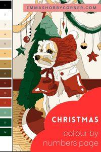
Some Colour By Number books naturally require lots of different colours, while detailed illustrations may need additional shades for skin, hair and backgrounds.
But for most colouring books, starting with a smaller palette is one of the easiest ways to improve your finished pages.
You might also like:
- Ohuhu to Decotime converter
- Ohuhu palette generator
- Are Temu colouring books any good?
- Girl Moments completed pages
- Decotime skintones
How to Use the Decotime Palette Generator
Using the generator couldn't be easier.
Step 1 – Choose how many colours you'd like
You can generate anything from a small, simple palette to a much larger colour collection.
If you're unsure where to start, I'd recommend choosing six colours.
Step 2 – Pick a theme
You can generate completely random palettes or choose from themed options such as:
- Autumn
- Spring
- Summer
- Winter
- Christmas
- Halloween
- Valentine's Day
- Pastels
- Vintage
- Warm colours
- Cool colours
- Neutrals
- Bright colours
Each theme is designed to give you inspiration while still producing plenty of variety.
Step 3 – Generate your palette
Press the button and the generator will instantly create a coordinated colour palette using Decotime alcohol markers.
Step 4 – Lock your favourites
Found the perfect green?
Love that dusty pink?
Simply lock those colours before generating again and the rest of the palette will refresh around them.
This is one of my favourite features because it lets you gradually build the perfect colour combination.
Step 5 – Save your palette
When inspiration strikes, don't lose it.
Save your favourite palettes so they're ready for your next colouring session.

You'll soon build a collection of tried-and-tested combinations for every season and every type of colouring page.
DecoTime Palette Generator
My saved palettes
Found a mistake, broken link or something that doesn't look right?
Let me know →My Favourite Ways to Use This Generator
Although I built this tool specifically for Decotime alcohol markers, I find myself using it far more often than I ever expected.
Some of my favourite uses include:
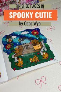
- Choosing colours for Coco Wyo books.
- Creating cosy autumn palettes for Bold & Easy colouring books.
- Finding seasonal combinations for Christmas colouring.
- Building colour schemes before starting a journal spread.
- Planning handmade greeting cards.
- Creating cohesive sketchbook pages.
Sometimes I don't even have a particular picture in mind.
I'll simply generate a palette and challenge myself to create something using those colours.
It's a fantastic way to experiment with combinations that I probably wouldn't have picked myself.
Colour Palette Ideas for Every Season
One of my favourite ways to use the palette generator is to create colour schemes based on the season. Even if I'm colouring exactly the same illustration, changing the palette can completely transform the finished page.
Here are some of the combinations I find myself coming back to throughout the year.
Autumn Colour Palettes
Autumn is probably my favourite season to colour. Rich, warm shades instantly make a page feel cosy, especially if you're colouring pumpkins, woodland animals, cafés or cottage scenes.
Try combining colours like:
- Rust orange
- Burnt sienna
- Mustard yellow
- Olive green
- Chocolate brown
- Deep burgundy
These colours work beautifully in cosy colouring books and create that warm, autumn afternoon feeling.
Winter Colour Palettes
Winter doesn't have to mean using only blues.
I like mixing cool shades with soft neutrals to create snowy landscapes and cosy interiors.
Some of my favourite winter colours include:
- Ice blue
- Navy
- Cool grey
- White highlights
- Soft lavender
- Silver
Adding just one warm accent, such as a rich red scarf or glowing yellow window, can really bring a winter page to life.
Spring Colour Palettes
Spring is all about fresh, delicate colours.
Think blossom trees, baby animals and bright mornings.
Lovely combinations include:
- Soft pink
- Lilac
- Mint green
- Butter yellow
- Sky blue
- Peach
These colours work brilliantly for floral colouring books and cute animal illustrations.
Summer Colour Palettes
Summer gives you permission to be bold.
Bright skies, colourful flowers and beach scenes all suit more vibrant palettes.
Try mixing:
- Turquoise
- Coral
- Bright yellow
- Lime green
- Hot pink
- Aqua
These cheerful combinations instantly make pages feel sunny and full of energy.
Halloween Colour Palettes
Halloween doesn't have to be black and orange.
Some of my favourite spooky palettes include rich purples, toxic greens and deep reds.
Try combining:
- Pumpkin orange
- Black
- Purple
- Lime green
- Dark grey
- Crimson
These colours work brilliantly for ghosts, witches, haunted houses and magical illustrations.
Christmas Colour Palettes
Traditional Christmas colours never go out of style, but I also love experimenting with softer festive combinations.
Classic Christmas palettes include:
- Holly green
- Deep red
- Gold
- Brown
- Cream
For something a little different, try:
- Sage green
- Dusty pink
- Champagne
- Warm grey
- White
It creates a much softer, modern festive look.
Colour Palettes for Different Colouring Styles
Not every colouring book suits the same palette.
Choosing colours that match the style of illustration can make a huge difference to the finished page.
Cute Colouring Books
Cute illustrations often look lovely with lighter, softer colours.
Pastels, peaches, mint greens and baby blues all work beautifully.
Fantasy Pages
Fantasy illustrations are a great opportunity to experiment.
Don't be afraid to colour purple trees, turquoise foxes or pink castles.
The palette generator is brilliant for pushing you outside your comfort zone.
Nature Pages
For woodland scenes and landscapes, I like choosing lots of earthy colours.
Greens, browns, creams and muted blues create natural-looking pages without feeling dull.
Floral Pages
Flowers give you endless opportunities to experiment.
Sometimes I'll generate a completely random palette just to see what unusual flower colours I can come up with.
Pink leaves?
Blue roses?
Why not!
One of the joys of colouring is that nothing has to be realistic.
Simple Colour Theory (Without the Complicated Bits)
You don't need an art degree to create beautiful colouring pages.
Understanding just a few basic ideas can make choosing colours much easier.
Warm Colours
Warm colours include reds, oranges and yellows.
They create cosy, energetic and cheerful pages.
They're perfect for autumn, sunsets and cafés.
Cool Colours
Cool colours include blues, greens and purples.
They tend to feel calmer and more peaceful.
They're ideal for winter scenes, oceans and forests.
Complementary Colours
Complementary colours sit opposite each other on the colour wheel.
Some examples are:
- Blue and orange
- Purple and yellow
- Red and green
Using complementary colours together creates strong contrast and helps certain areas stand out.
Similar Colours
Colours that sit next to each other naturally work well together.
For example:
- Blue
- Blue-green
- Green
These palettes create soft, harmonious colouring pages that feel very relaxing.
Common Mistakes When Choosing Colour Palettes
I've made every one of these mistakes over the years.
Hopefully I can save you from making the same ones.
Using Too Many Colours
Just because you own hundreds of markers doesn't mean every page needs hundreds of colours.
Often, fewer colours create much stronger results.
Forgetting Dark Colours
It's easy to fill a page with lovely pastel shades and then wonder why everything feels a little flat.
Adding one or two darker shades instantly creates depth and contrast.
Ignoring Neutrals
Brown, beige and grey markers don't look particularly exciting on their own.
But they're often the colours that pull an entire palette together.
Some of my favourite colouring pages rely heavily on neutral shades.
Playing It Too Safe
We all have favourite colours.
Mine definitely get used far more often than they should!
Sometimes the best pages come from combinations I would never have chosen myself.
That's exactly why I love using the random palette option.
It encourages me to try colours that have been sitting untouched in my marker case for months.
Why Swatching Still Matters
Even though the palette generator gives you colour suggestions, I'd always recommend swatching your markers before starting a finished page.
Marker colours can vary slightly depending on:
- The paper you're using.
- How heavily you apply the ink.
- How the colour dries.
- The lighting in the room.
Computer screens can also display colours differently, so a colour that looks slightly warm on your monitor may look cooler in real life.
I keep my own swatch cards close by whenever I'm colouring. It only takes a few seconds to compare colours, but it can save a lot of disappointment later.
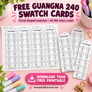
If you haven't already, you can also download my free printable Colour By Number swatch cards, which were designed specifically to make colour matching easier.
Challenge Yourself with Random Palettes
One of my favourite ways to use this generator has nothing to do with planning.
Sometimes I'll simply press "Generate" and promise myself that I'm going to colour an entire page using whatever palette appears.
It's surprising how creative this can be.
Instead of automatically reaching for my usual pinks, teals and browns, I end up experimenting with colours I'd probably have ignored.
Some of my favourite finished pages have come from these random challenges.
Even if a palette feels unusual at first, I'd encourage you to give it a chance. You might discover a new favourite colour combination that you'd never have created yourself.